Charts and graphs in Row Zero
Row Zero makes it easy to chart big data sets in a spreadsheet. Charts dynamically update as source data changes. You can build charts from cell ranges and connected tables, and also create pivot charts from pivot tables. The documentation below shows how to create and work with various chart types in Row Zero.
- Creating a chart
- Configuring your chart
- Configuring a series
- Creating a histogram
- Connected charts
- Pivot charts
- Tips for working with charts in Row Zero
- Video tutorial
Creating a chart
Select the data you wish to chart and click on the chart button in the header or go to Insert, Chart. 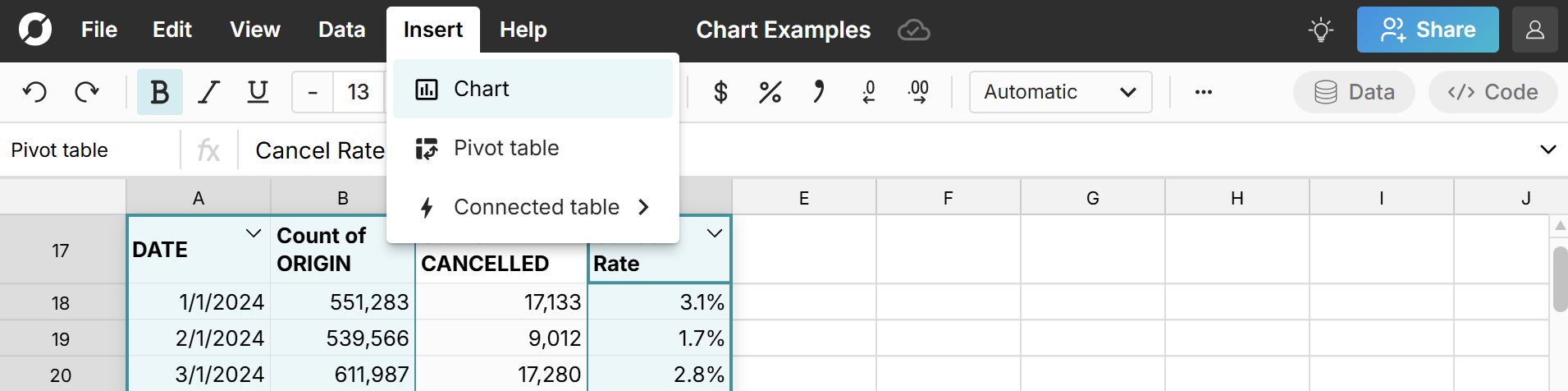
A chart is automatically created based on the range selected and a chart window expands from the right side of the screen where you can configure your chart. 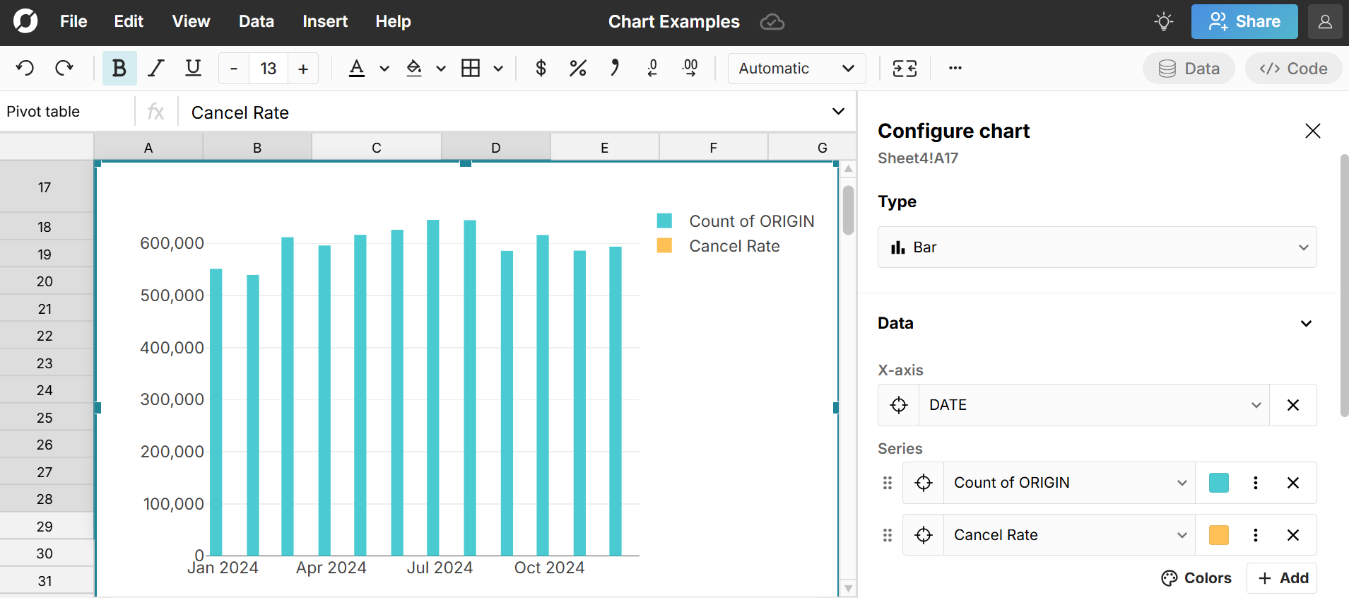
Configuring your chart
Use the chart window to configure your chart with the following options:
- Type: Chart types include bar, line, scatter, and histogram
- Data: Set the X-axis and add, remove or configure series
- Labels: Set labels for Title, X-axis, and Y-axis
- Vertical Axis: Set min and max values or select logarithmic.
- Legend: Toggle legend on/off and change its position
Configuring a series
To configure a series, click the 3 dots in the series to open the series window. 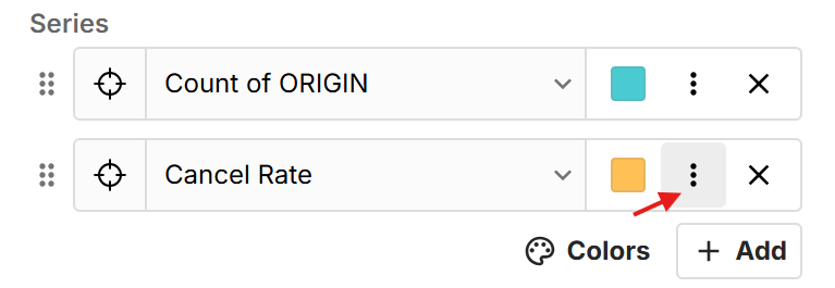
For bar, line, and scatter plots, each series in a chart can be configured with the following options:
- Axis side (left or right)
- Series type
- Bar
- Line, with options for line style, line width, marker size, and marker shape
- Scatter, with options for marker size and shape
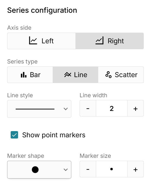
Note that you can create a mixed chart that has different series types in the same chart. For example, you can have a bar and line series on the same chart. You can also put a series on the left axis and a series on the right axis in the same chart. This is useful when your series have very different scales but you want to represent them in the same view. 
Edit series color
Each series is given a color by default. You can manually change the color of a series by clicking on the color square next to it. 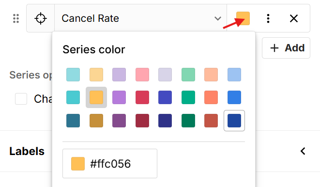 You can also set the color palette across all series in the chart by clicking the 'Colors' icon below all series. This includes color-blind friendly chart options.
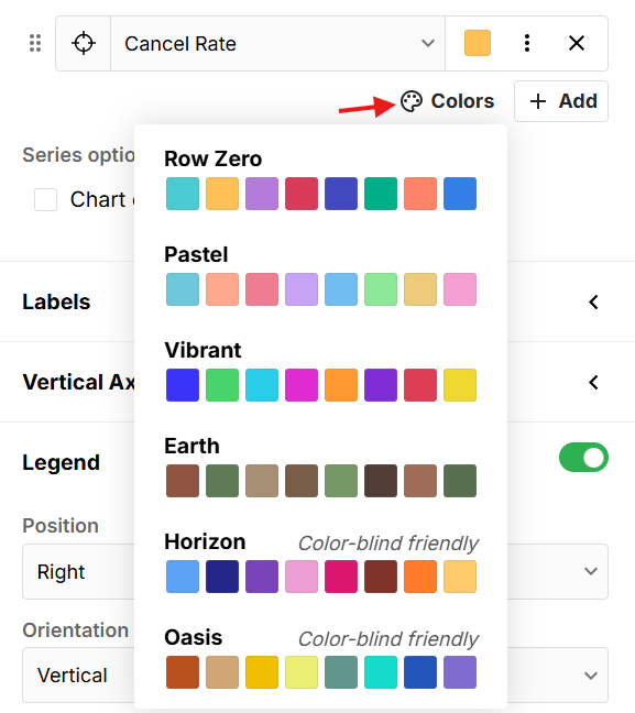
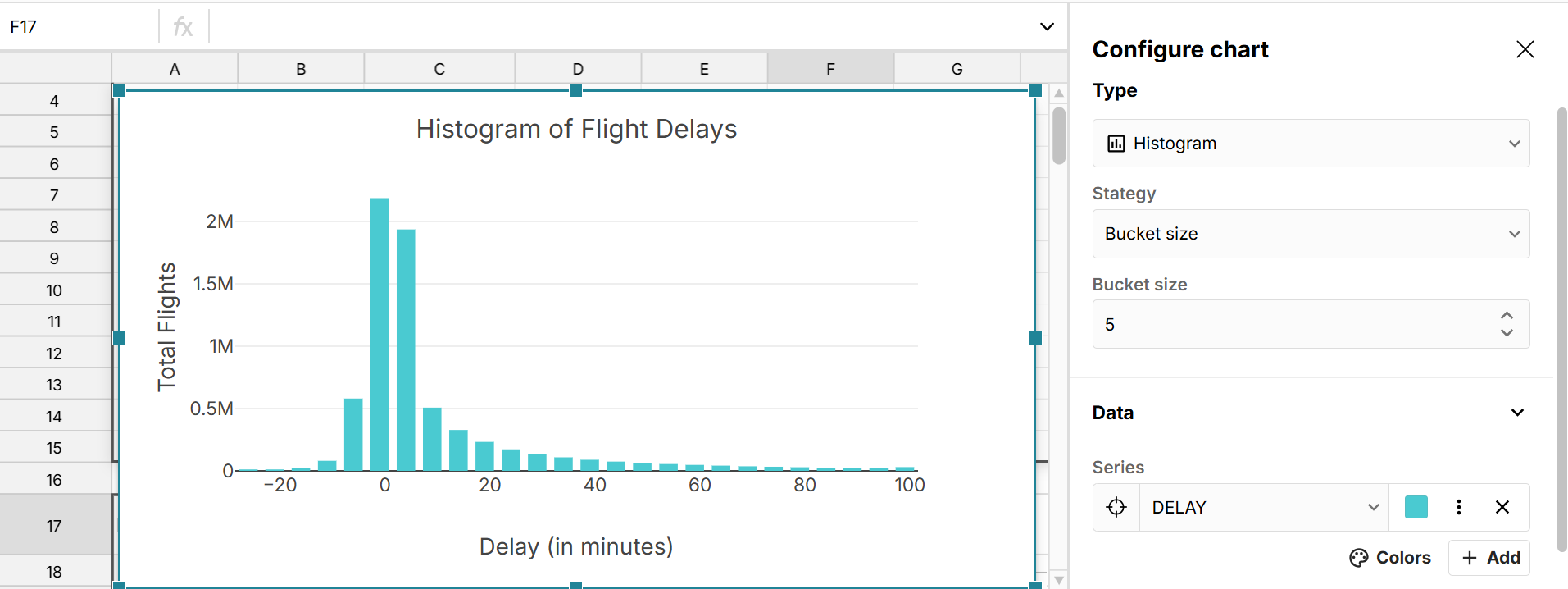
Creating a histogram
When you choose the Histogram chart type, you can set the strategy to bucket size, bucket count, or custom.
- Bucket Size: Set the size of each bucket and the data will be grouped into as many buckets of that size that are needed to include all values.
- Bucket count: Set the number of buckets to include and the data will be grouped into that many buckets of the same size so that all values are included in a bucket.
- Custom: Manually set the upper bounds of each bucket using a range in your sheet. This makes it possible to create a histogram with buckets of different sizes.
Histograms display the upper bounds of each bucket on the x-axis and the count in each bucket on the y-axis.
Connected charts
Create connected charts that automatically update with new data as your source data updates. Row Zero has built-in connections to Snowflake, Databricks, Redshift, BigQuery, and Postgres. When you connect to a data source, queried data is imported to a connected table, which you can use as source data for your charts. When you re-run your query or schedule auto-refresh, your charts update in sync with your connected table. 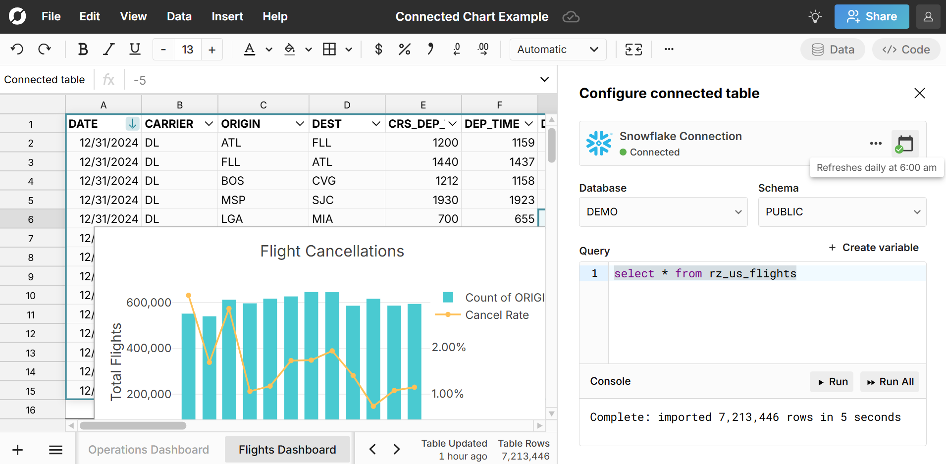 Learn more about how to create connected spreadsheets.
Pivot charts
Create a chart from pivot table data to make a pivot chart. Simply select a cell in each of the pivot table columns you want to include in your chart and go to Insert, Chart in the header navigation. Note that charts created from pivot tables use entire columns as source data. Pivot charts dynamically update in sync with your pivot table as you edit, filter, and sort your pivot table and as your pivot table's source data is updated.
You can add calculated columns to your pivot table and include them as series in your pivot chart. You can also group dates in pivot tables to make it easy to chart by month, week, day, etc. 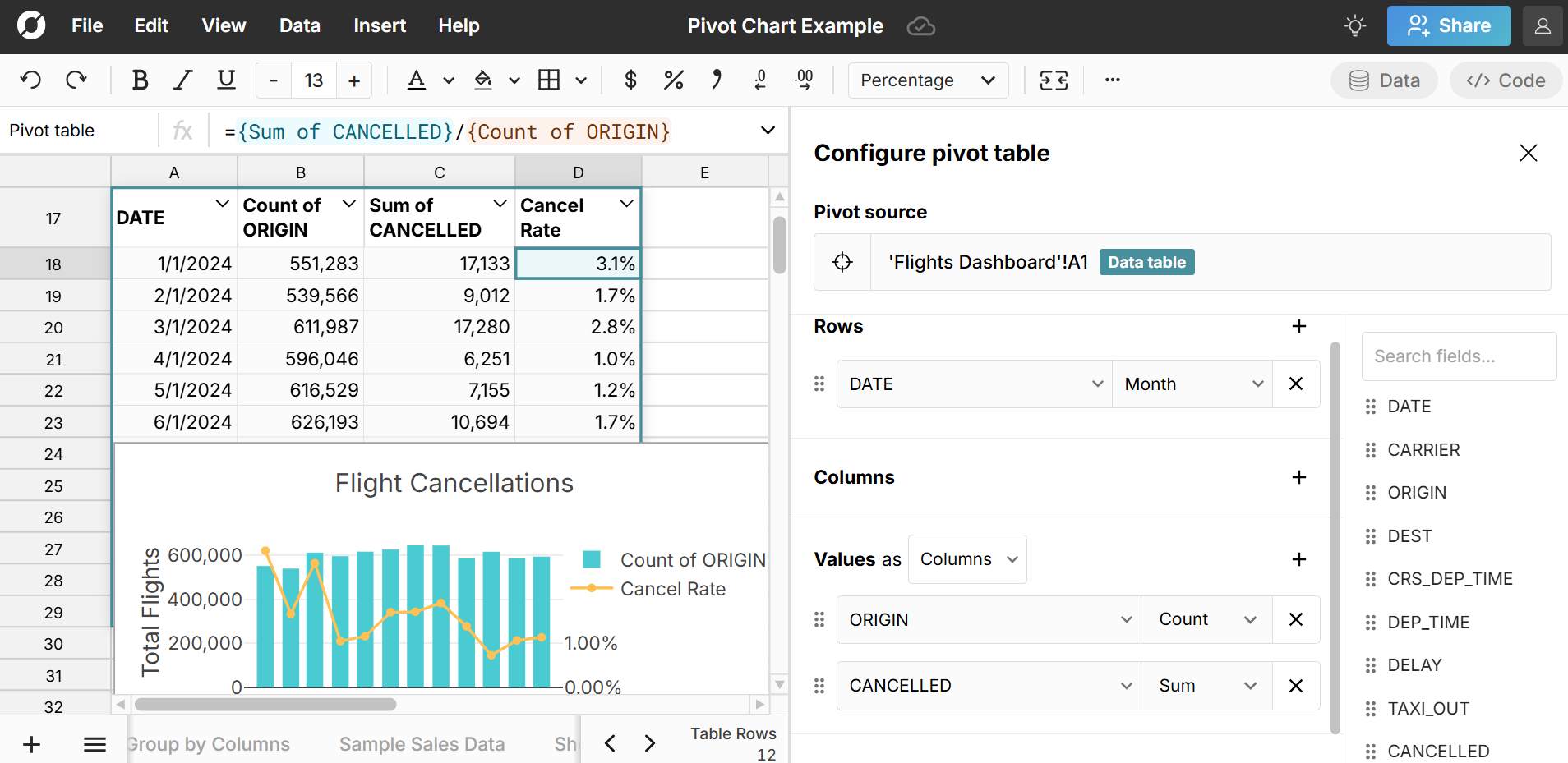 Learn more about how to create dynamic pivot charts.
Chart rows as series
You can chart rows as series by selecting this option in the chart editor. 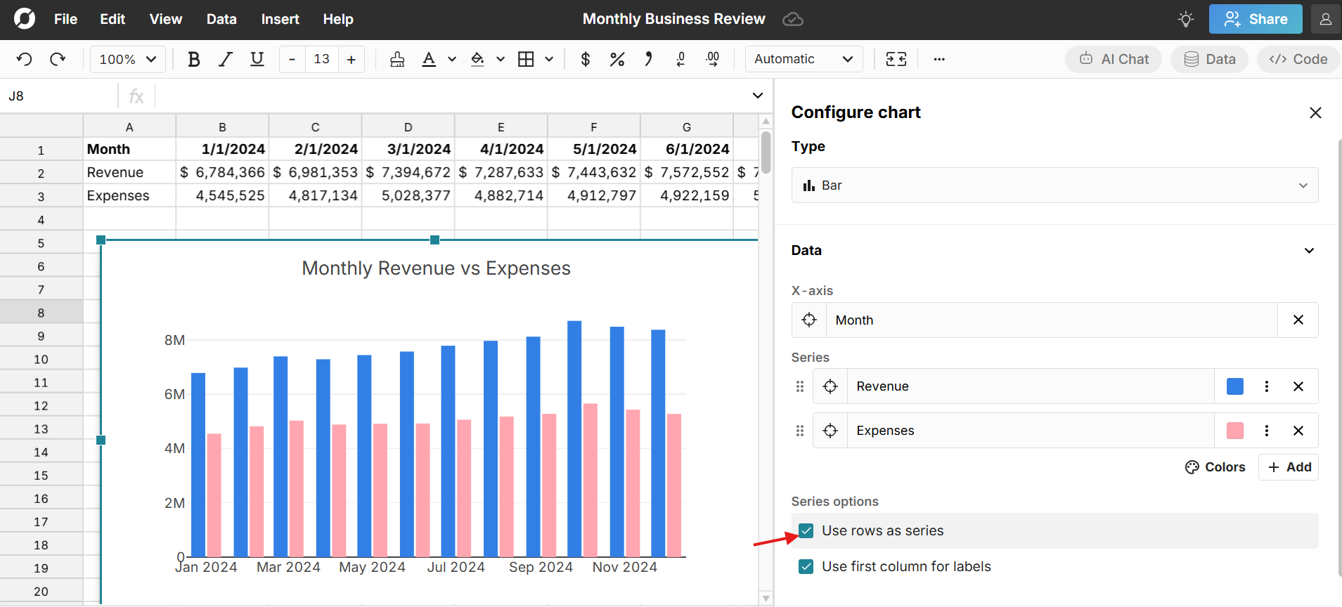 This is useful for charting data that is organized with dates in columns and series in rows and is used to switch rows and columns in the chart configuration.
Chart columns as series
When charting data in a data table (pivot tables, connected tables, etc.), you have the option to select 'Chart columns as series'. 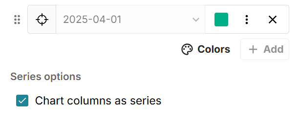 When selected, this automatically charts every column in the table as a series and automatically includes any new columns that are added as your data updates. By default, the first column is set as the X-axis, but you can change the X-axis to be any column in the table. Note that the "Chart columns as series" feature requires every column to be included as a series (or chosen as the X-axis). If you remove a series manually, the "Chart columns as series" option is unselected and new columns will not dynamically be added.
Tips for working with charts in Row Zero
Charts dynamically update with their source data. You can filter, sort, and format source data to easily filter and re-arrange your chart. As source data is refreshed with new data, connected charts will automaticallly update with the new data as well.
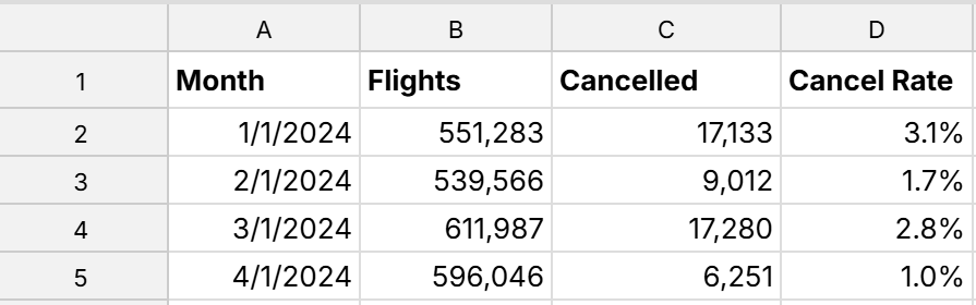
You generally want to organize your series in columns instead of rows. For example, to chart data over time, have a column for your date/time groupings (e.g. months), with rows for each date/time grouping and columns for each series.
 If you need to switch data from rows to columns, you can transpose your data by selecting and copying it, and then right-clicking, 'Paste special', 'Paste values (transposed)'.
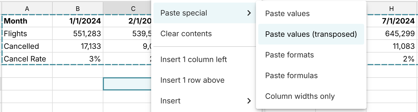
Series configuration gives you a lot of options for visualizing data. In addition to changing colors, each series can be a different chart type and you can set series to either the left or right axis. This can be helpful when working with series that have very different scales that you want to display in the same chart.
Creating a chart on pivot table data is a powerful way to quickly analyze and manipulate your data visually. Pivot charts dynamically update in sync with your pivot table as you edit, filter, and sort your pivot table.
If your pivot table or connected table will add columns as data changes, select Chart columns as series to dynamically include these new columns in your chart.
Video tutorial
Here's a video tutorial of how to create a dynamic pivot chart from pivot table data in Row Zero:
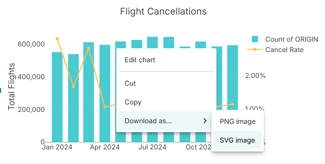
Editing charts
To edit a chart, double-click on the chart to re-open the chart window. You can also right-click and select 'Edit chart'. As you make changes in the chart window, the chart dynamically updates to reflect the changes.
Cut, copy, paste, and move charts
You can cut, copy, and paste charts with both keyboard shortcuts and by right-clicking on the chart and selecting the action. Use Ctrl+C for copy, Ctrl+X for cut, and Ctrl+P for paste. You can move a chart by clicking and dragging around the screen.
Download charts as SVG or PNG
Download your chart as an SVG or PNG by right-clicking on the chart and selecting the file type. SVG charts are recommended for high quality displays, scalability, and ease of editing. PNG charts are better for simpler use cases and are more universally compatible with other platforms.